


Branding lessons rock-n-roll can teach the real estate world
September 18th, 2024
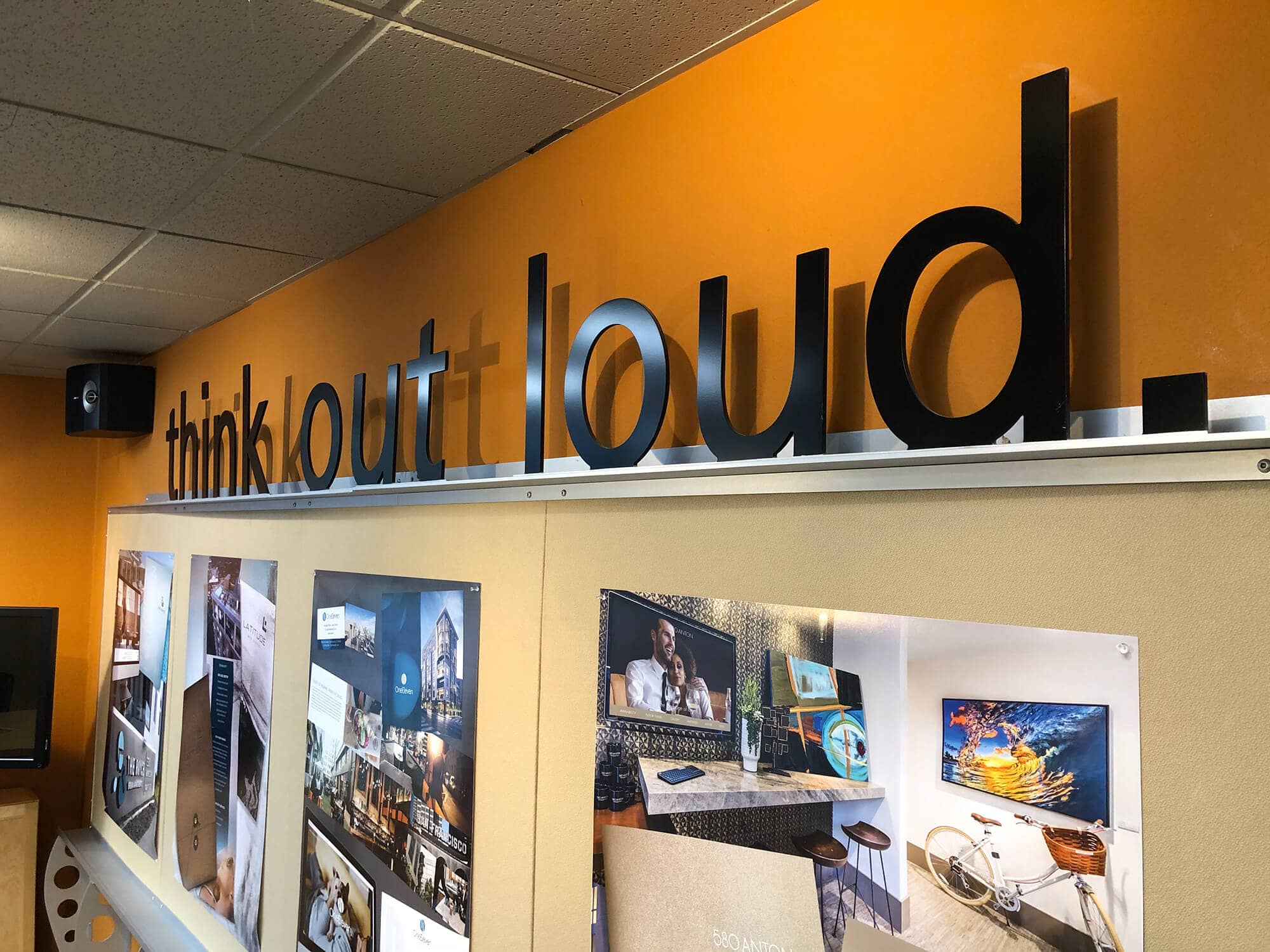
At P11, we’re all about music. And we’re also about marketing. In this insightful thought leadership content, we show you how these two worlds intermingle. Rock-n-roll logos are more than just band symbols—they’re timeless emblems that communicate identity, emotion, attitude, and a lifestyle. And real estate marketing absolutely lives for lifestyle. While they may seem specific to the rock world, they hold valuable lessons for marketing and branding in any industry. They teach us that branding isn’t just about looking good; it’s about embodying what a company or product stands for. Let’s learn from the masters.
![]()
GO BOLD
Arguably one of the most recognizable logos in history, the Rolling Stones’ tongue and lips logo screams rebellion, freedom, and unabashed self-expression. Designed by John Pasche in 1970, the image captures the band’s raw, provocative spirit. The brilliance of the Stones’ logo is in its simplicity and boldness. For marketers, this highlights the power of associating a brand with a clear, identifiable symbol. The tongue reflects not just the band’s name but its defiance — just like a great logo should encapsulate the core message of a brand. A company that wants to stand out should embrace its uniqueness and find a symbol that distills its essence into a single image.
![]()
BE SIMPLE YET SYMBOLIC
The Lightning Bolt Lesson: Consistency and Simplicity AC/DC‘s logo, with its sharp lettering and signature lightning bolt, reflects the band’s electric energy and hard-rocking ethos. Created by graphic designer Gerard Huerta in 1977, it still symbolizes the band’s unwavering consistency in delivering high-energy rock. The lesson for marketers? Simple, powerful, clutter-free imagery can be highly effective. On a related note, David Bowie’s lightning bolt design continues to be synonymous with Bowie’s legacy and brand. New merch is always coming out with that imagery.
![]()
HAVE A BACKSTORY
Storytelling and Heritage Queen’s intricate logo, designed by frontman Freddie Mercury, incorporates elements from the zodiac signs of all four band members, combined with imagery of lions, a phoenix, and a crown. It’s as theatrical and grand as the band itself, evoking a sense of royalty and grandeur. The marketing lesson here is the value of storytelling and heritage in branding. Queen’s logo is rich with symbolism, tapping into a larger narrative about who they are as a band and where they come from. Successful brands often leverage their backstory to create a narrative that consumers can buy into. Whether through imagery or content, logos can connect prospects to the brand journey.
![]()
CONNECT WITH YOUR AUDIENCE & LEAD A NEW GENRE
Nirvana’s smiley face logo is deceptively simple but packed with emotional resonance. Designed in 1991, it became synonymous with the grunge movement and the band’s anti-establishment ethos. The irreverent smile, mixed with a carefree sense, perfectly encapsulates the band’s blend of dark and light themes. It’s authentic. For branding, this shows how tapping into emotion can create a powerful connection with your audience and how consumers respond to authenticity. A great logo doesn’t just represent a brand; it should make people feel something.
![]()
LEAN INTO YOUR NAME & ELEVATE IT
Van Halen’s logo, with its bold wings and striking symmetry, embodies motion. It also embraces the unique spelling courtesy of Eddie and Alex Van Halen. The key marketing lesson for real estate professionals? Lean all the way into your brand name’s uniqueness. Have fun with it. Don’t water down what is intrinsically a strength. And even if your brand name is simple, it can still take flight in new and exciting ways through branding. This is a tremendous lesson in brand ideation and naming studies, both of which, P11 does extremely well for our strategic partners.
LET P11 ROCK YOUR BRANDING
With over 35 years of acclaimed experience in the real estate/building industry, P11 is here to make your brand take center stage and achieve success. Our award-winning design team has been recognized nationally for our distinction with brand ideation that honors our clients’ values, the product, and intended audience. Always bringing imagination to the forefront like never before. We’re also very skilled at establishing and managing graphic continuity for all aspects of your community’s marketing to ensure a seamless look across all aspects/mediums for top quality and integrity. P11 is your one-stop shop for all things marketing.
Contact us, and let’s amplify and rock your brand now! And be sure to check out P11 FM on Spotify to see our curated playlists!

P11 Finalists for The Nationals 2025
2024 Multifamily Holiday Ornament Exchange at Bloom
Top Changes in Meta Advertising for 2025
ALL DECKED OUT: P11 Holiday Party 2024
P11 FM 2024 Holiday Lounge is here
Effortless website migration solutions for Property Management
BRAND IDEATION BEGINS AT HOME: The creation of P11’s...
Brianna Massas joins P11 as Vice President Of Digital Marketing
A NEW LEASE ON LIFE: Paladia rebranding & marketing
Building Success, One Enclave at a Time: How P11’s...
Seeing is believing: P11’s Rendering Solutions
B2B Marketing: The Previti Group Launch
A NEW P11 FM MIX TO BE THANKFUL FOR
LET’S AMPLIFY THE COMPASSION AGAIN
BOUTIQUE MEETS CHIC: The One Ten marketing
LEARN HOW FONTS CAN MAKE A BRAND